Color has the power to invigorate our senses and imbue space with unexpected joy.
As architects and designers, we recognize the important impact color can have in shaping built environments. By thoughtfully incorporating diverse palettes, we create spaces that are at once stimulating and harmonious, elevating our experience of the built environment.
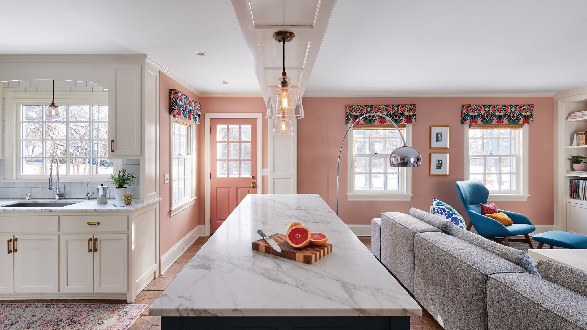
Inspired by the homeowners’ Hans Hoffman Gallery Exhibition poster, this multifunctional family space was recently featured in a Midwest Home Magazine article on the power of color in interior design.

Photography is courtesy of Corey Gaffer.
This multifunctional family space uses pink, coral, blue, and green to create a vibrant palette that reflects their personal styles in a one-of-a-kind “Old Hollywood meets Palm Springs” fashion.
Prioritizing both aesthetic appeal and functionality, the project exemplifies a bold and masterful use of color. To personalize the space, a beautifully textured dusty pink wallpaper adorns the entertainment unit, while a coordinating pink hue from Benjamin Moore, described by our very own Sarah Hughes as “deep, rich, and cozy,” decorates the walls throughout.
Click here to view the full article, published by Midwest Home Magazine on October 7, 2024.
